How Small Game Teams Can Build Cohesive Pixel Art Assets
Key Takeaways
- Consistent visual rules make sprites, tiles, icons, and effects feel like parts of one game.
- A focused palette, readable silhouettes, and stable animation proportions matter more than adding excessive detail.
- AI tools can accelerate ideation and variations, but final assets still need human direction and cleanup.
- Testing art inside the game reveals problems that are easy to miss on a zoomed-in canvas.
- Clear naming, export, and review habits reduce rework for small teams.
Why Cohesion Matters More Than Asset Count
Small teams rarely have unlimited time for art production. A game may need characters, environments, items, interface elements, effects, and animation while the same people are also handling design, programming, testing, and release planning. In that situation, a smaller asset library with a clear visual language usually creates a stronger impression than a large collection of images that do not match.
Pixel art depends on deliberate choices about grid size, color, shape, and contrast. An AI pixel art generator can be useful for exploring early character poses, prop directions, or palette-based variations, but it works best when the team has already defined what the final game should look like. Every new asset should reinforce the same rules rather than introduce a new visual style.
Set Visual Rules Before Drawing
Start with a short art guide that everyone can use. It does not need to be a lengthy document. One page can prevent many inconsistent decisions later. Define the intended sprite dimensions, the scale used in the game world, the direction of the main light source, and the approach to outlines. Also, decide how much detail a character or item can contain before it becomes difficult to recognize during play.
Pixel art is built through the intentional placement of visible pixels, which is why consistent constraints are so valuable. A shared understanding of how pixel art uses pixels as its core building blocks helps a team avoid treating the style as a simple low-resolution filter. Decide whether the game uses crisp single-pixel edges, thicker outlines, selective outlines, or no outlines at all, then apply that choice consistently.
Build a Small Palette With a Clear Purpose
Choose colors by function, not only by preference. A practical core palette may include background colors, shadows, midtones, highlights, neutral colors, and a small number of accents. Reserve highly visible colors for information the player needs to notice quickly, such as danger, healing, interactable objects, or rare rewards.
For example, if a bright teal is used for the player character’s scarf, avoid using the same teal across ordinary rocks, walls, and background plants. The color then becomes a useful point of attention instead of visual noise. Test the palette in bright locations, dark locations, menu screens, and combat scenes before creating a full set of assets.
Make Silhouettes Read at Game Size
Shape comes before detail. A player should be able to distinguish the hero from an enemy, a pickup from decoration, and a hazard from safe terrain without stopping to inspect individual pixels. Test important sprites as solid dark shapes. If two characters look nearly identical without their internal shading, adjust their proportions, poses, accessories, or equipment.
View assets at their actual gameplay scale inside the engine. A face, buckle, or texture pattern that looks appealing at 800 percent zoom may disappear entirely during movement. Common issues include crowded limbs, weapons that blend into the body, weak contrast against terrain, and poses that do not clearly show which direction a character faces.
Plan Animation as a System
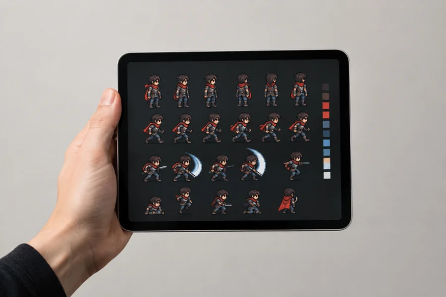
Animation should be planned before every frame is polished. First, identify the actions that gameplay truly needs, such as idle, walk, attack, damage, and interaction. Then establish consistent anchor points for feet, body center, hands, and held equipment. These references help prevent a character from appearing to grow, shrink, float, or slide between frames.
- Choose the smallest frame count that communicates the action clearly.
- Keep body proportions stable from frame to frame.
- Mark contact points before adding secondary motion.
- Preview the animation at its intended in-game speed.
- Adjust timing and spacing before adding extra shading or effects.
A complete animation can still feel awkward when its timing is unclear. A hit should read as impact, a walk should show weight transfer, and an idle should not distract from gameplay. Build one full action cycle at a time rather than creating scattered single frames for many different actions.
Use AI-Assisted Workflows With Human Direction
AI-assisted tools can support rough concept variations, item ideas, pose exploration, palette experiments, and early mood references. They can be especially helpful when a team needs to compare several directions before committing to hand cleanup. However, generated output should be treated as a draft until it has been checked against the project’s visual rules.
Review every proposed asset for grid alignment, stray pixels, silhouette clarity, lighting direction, palette discipline, and animation continuity. A human artist, designer, or art lead should make final decisions about what belongs in the game. Keep original sketches, prompts, edits, and source files organized so the team can understand how an asset evolved and revise it later.
Create Assets in Batches
Batch production reduces context switching and makes comparisons easier. Work through related assets together: player outfits, common enemies, elite variants, weapons, terrain tiles, interface icons, or status effects. For animation, complete a character’s walk cycle before moving on to attack, damage, and idle states. This makes proportion, color, and outline inconsistencies easier to spot while the visual decisions are still fresh.
Keep the Pipeline Organized
Use file names that identify the character or object, action, direction, and frame. Keep editable source files separate from exported game files and experimental drafts. Record each asset’s frame size, pivot or anchor point, scale setting, and export format. Modern game engines also provide structured sprite workflow documentation, and testing import settings before an entire batch is finished is a useful reminder.
Review Assets Inside the Game
An asset can look excellent in an art application and still fail during play. Review it against the backgrounds where it will appear, during movement, beneath screen effects, and beside other characters. Check menu spacing, inventory readability, combat clarity, and animation timing at the game’s intended resolution. Ask playtesters to identify threats, pickups, and player characters without explanation. Their hesitation often reveals a readability problem worth fixing.
Know When to Simplify
Simplification is not a reduction in quality. Remove colors that do not improve recognition, details that vanish at normal scale, and decorative effects that compete with important gameplay signals. Stronger shape changes, clearer value contrast, and more intentional spacing often communicate more than additional texture ever could.
Final Checklist for a Cohesive Asset Set
- Target resolution, grid rules, and light direction are documented.
- Palette roles and reserved gameplay colors are defined.
- Characters, hazards, and pickups remain readable at game size.
- Animation frames share stable proportions and anchor points.
- Files follow a consistent naming and export system.
- Assets have been reviewed in real gameplay scenes.
- Tool terms, source records, and ownership considerations have been reviewed before release.
The goal is not to produce the most pixel art possible. It is to make every sprite, tile, icon, and effect feel intentional together. When a small team defines its visual rules early, works in focused batches, and tests frequently inside the game, it can build an asset set that feels polished, readable, and distinctly its own.