How Do You Make Music and Film Channel Thumbnails That Stand Out in 2026?
On YouTube, a video is judged long before anyone presses play. Viewers scan a home feed or search page in seconds, and the small image beside each title decides whether they stop or keep scrolling. For creators who cover songs, albums, trailers and movies, that decision is even harder because the competition is huge and the subjects often look alike.
Good music and film channel thumbnails solve that problem. They tell a viewer what the video is about, set the right mood and promise something worth watching. This guide explains what makes a thumbnail work for these two niches and how to build one that earns honest clicks.
Why Thumbnails Matter So Much for Music and Film Channels
YouTube Analytics reports a figure called impressions click-through rate. It shows how often people who saw your thumbnail chose to watch. A higher rate tells the recommendation system that your video is relevant, which can lead to more impressions over time.
Music and film content has a special challenge. A cover version, a reaction, a review and an official clip of the same song or movie may all appear side by side. Titles alone rarely separate them. The thumbnail is often the only thing that shows what makes your take different, whether that is a personal reaction, a deep analysis or a fresh performance.
Tools That Make Thumbnail Design Faster
Most creators do not have a designer on call, so speed matters. A modern workflow usually combines a clear screenshot or photo, a simple editing app and, increasingly, AI assistance. For quick drafts, an ai thumbnail generator online such as the one in CapCut’s web tools can suggest layouts, backgrounds and text styles from a short description, which you can then refine by hand.
AI tools work best as a starting point. Creators who get strong results still choose the final frame, adjust colours to match their channel and check that the image is accurate. Think of these tools as a way to test more ideas in less time, not as a replacement for your own judgement.
Core Design Rules for Music and Film Channel Thumbnails
Whatever the genre, a few principles appear again and again in thumbnails that perform well.
Design for a small screen first
A large share of YouTube viewing happens on phones. Your thumbnail may be seen at the size of a postage stamp. If the main idea is not clear at that size, it will not work anywhere. YouTube recommends uploading at 1280 by 720 pixels in a 16:9 ratio, but always preview the image at a much smaller size.
Use one clear focal point
Pick a single subject: a face, an instrument, a character or a key object. Crowded images with several competing elements tend to blur together in a busy feed.
Show real emotion
Faces with genuine expressions attract attention. Surprise, joy, tension or focus can all work, as long as the emotion matches what happens in the video.
Push contrast, not clutter
Bright subjects on darker backgrounds, or complementary colours such as blue and orange, help an image pop. Avoid matching the colours of the YouTube interface itself, since white or very light backgrounds can disappear on the page.
Keep text short
Three to five words is usually enough. The text should add to the title, not repeat it. Bold, simple fonts remain readable even on small screens.
Build a recognisable channel style
Over time, viewers should be able to recognise your videos before they read the channel name. Pick two or three brand colours, one font family and a consistent position for your face or logo, then reuse them across uploads. A film essay channel might always place a muted still on the left and a single bold word on the right, while a piano tutorial channel might show the same overhead angle of the keys every time. This kind of consistency builds familiarity, and familiar thumbnails often get clicked by subscribers who already trust your work.
Thumbnail Ideas for Music Channels
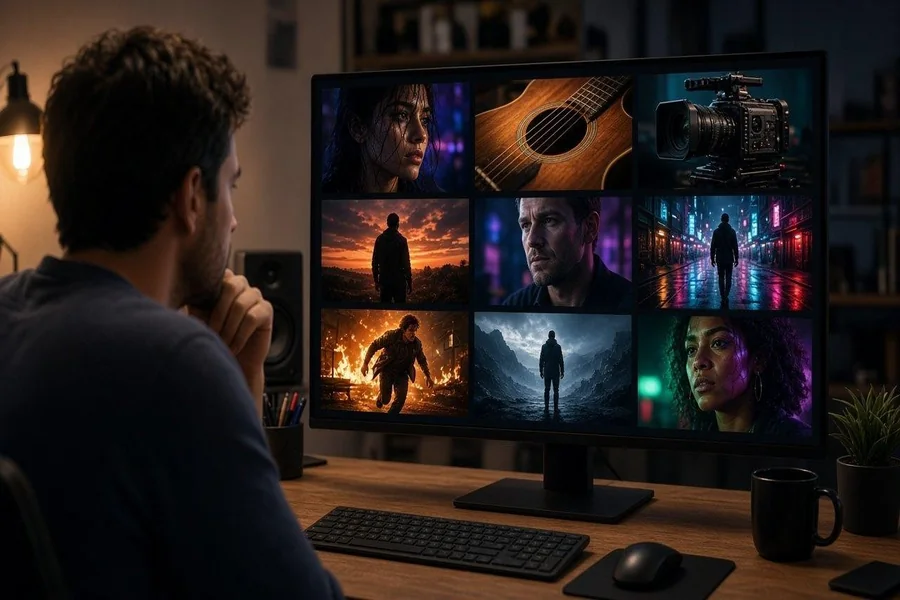
Music creators can draw on a long tradition of album artwork. The best music thumbnails feel like small posters for the sound.
- Performance moments: a singer mid-note or a guitarist in a dramatic pose shows energy instantly.
- Instrument close-ups: for tutorials, a clear shot of the fretboard or keys tells viewers exactly what they will learn.
- Genre colour cues: warm, grainy tones suit lo-fi and acoustic music, while neon and deep purples suit electronic tracks.
- Reaction framing: for reaction and review channels, your face beside the album cover or artist image sets the context straight away.
- Series consistency: a repeated layout for weekly covers or album reviews helps returning viewers spot new uploads.
Thumbnail Ideas for Film Channels
Film channels can borrow from movie poster design, where one striking image often carries the whole story. Designers such as Saul Bass showed decades ago that simple shapes and bold colour can be more memorable than busy scenes.
- Cinematic framing: use the rule of thirds and leave space for a short title.
- Mood lighting: fog, rim light and strong shadows signal thriller, horror or drama at a glance.
- Clear opinion: for reviews, a small symbol or word such as “Worth it?” hints at your verdict without spoiling it.
- Comparison layouts: split-screen designs work well for remake versus original or book versus film videos.
- Avoid spoilers: do not reveal major twists in the image. Viewers remember channels that ruin a plot.
When using film stills, remember that rights belong to the studio. Commentary and review channels often rely on limited use under fair use or fair dealing rules, but these depend on the country and context. Many creators prefer original designs or their own photos to reduce risk.

Testing and Improving Your Thumbnails
Even experienced creators cannot always predict which design will win. YouTube Studio now includes a Test and Compare feature that lets creators upload several thumbnails for one video and see which performs best. If it is available on your channel, use it on important uploads.
Other habits help too:
- Review click-through rate together with average view duration. A thumbnail that wins clicks but loses viewers quickly may be overpromising.
- Compare your thumbnails with the top results for the same search term. Look for ways to be different rather than identical.
- Refresh thumbnails on older videos that still get search traffic. A better image can give a second life to good content.
Mistakes That Hurt Trust
Clickbait might bring a short spike, but it damages a channel over time. YouTube’s policies discourage misleading thumbnails, and viewers who feel tricked leave quickly and may not return. Avoid images that show events or people not in the video, exaggerated claims and shocking edits that have nothing to do with the content.
Honesty and creativity are not opposites. The most successful music and film creators build thumbnails that are both eye-catching and accurate, so viewers feel the video delivers what the image promised.
Conclusion
Strong music and film channel thumbnails combine clear focus, real emotion, bold contrast and short, useful text. Music creators can lean on album art traditions and genre colours, while film channels can borrow poster design ideas and cinematic lighting. AI tools can speed up drafts, but your own choices make the final image work. Test different versions, watch click-through rate alongside watch time and keep every thumbnail honest. Do that consistently, and your videos will stand out in crowded feeds for the right reasons.